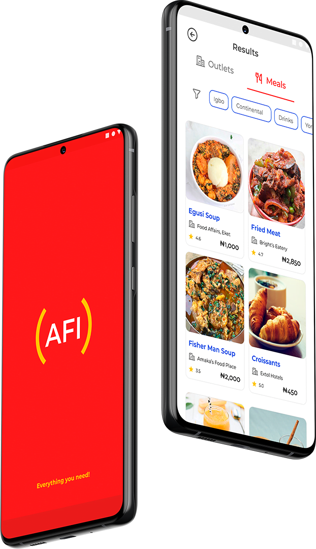
AFI is a table reservation and food ordering app that I worked on as a capstone project during my Product Design Program at Dufuna (Sponsored by UK-Nigeria Tech Hub).
AFI is a table reservation and food ordering app that I worked on as a capstone project during my Product Design Program at Dufuna (Sponsored by UK-Nigeria Tech Hub).
African Food Incorporated (AFI) is a chain of restaurants with a vision to deliver the best African cuisine to everyone across Africa. After a detailed analysis of the competitive landscape, African Food Incorporated’s founders John Kiagiri and Lola Mustafa decided to create an online food reservation and ordering system for all types of restaurants across the continent.
Their goal is that anyone anywhere in Africa can either:
from the neighbourhood food shack to the 5-star restaurant.
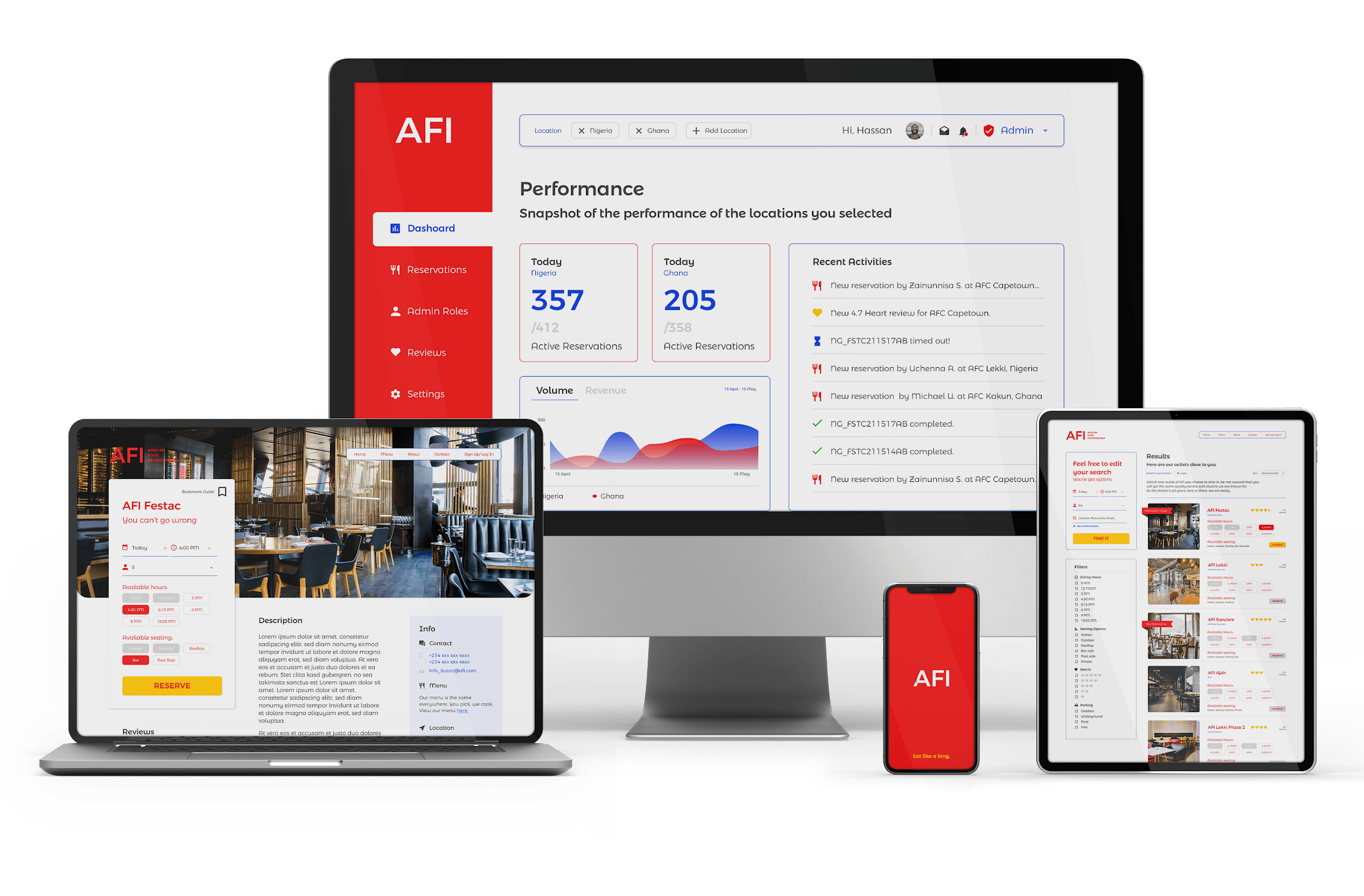
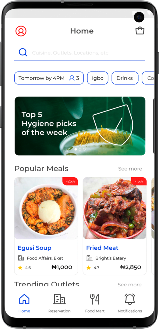
This project covered all aspects of product design and involved the creation of one product with three different touchpoints (End User Mobile & Web Apps, and Admin Web DashBoard). This portfolio will focus mainly on the Mobile App.
To solve the problem, I was paired with a teammate during the research and early creation phases. High-quality prototypes and final presentations were done by me.


We developed a survey to know if people would love ordering food, and making reservations. We also tried to understand factors that would encourage them to do this or not to do it as the case applied. We interviewed about 20 volunteers with unique qualities.
We created an empathy map to help us easily visualize the information we had gathered.
Analyzing the data from the empathy map helped us define our problems by understanding exactly what the final consumers desired from such an app.
We were able to uncover themes, understood the goals and frustrations of the users, and with these, we created user personas that represented our users.
With the problem now clear, we focused on trying to solve the problems outlined in our users’ pain points. We also looked for opportunities. Using the impact vs complexity prioritization technique, we succeeded in determining the MVP (Minimum viable products). A couple of ideas we had include:
User Flow & User Journey Maps were also developed for the MVPs.
The whole idea came to life following the design of a high-quality prototype that represents our MVP. Of course, this was after sketching & low-quality prototyping stages.
The prototype was given to users and 90% of them could complete the important tasks that the app was created to do.
The program also had my solution reviewed and accessed by Mentors (experienced Product Designers).
Font Family – Montserrat

I went for a minimalistic UI design, and that made me go for stroked icons. Filled icons were only used to show active or selected elemens. Phosphor Icons from the Figma community was used for ease and consistency.

To improve ease of navigation, recognization and a fluid UX, I used colours consistently throughout the UI.

Buttons & Accents

Minor items like, Badges, Services, Stars

Texts, Borders, Lines, Inactive buttons

© Axenic Arts Design MMXXI. All Rights Reserved. Huge thanks to Anthony Boyd for his Amazing HQ Samsung Galaxy S9 Mockups, and to the Trio who spent time creating the Phosphor Icon Pack: your works have made my life way easier.